

Balance UT
Welcome visitors to your site with a short, engaging introduction.
Double click to edit and add your own text.
 |  |  |  |
|---|---|---|---|
 |  |  |  |
What is this project?
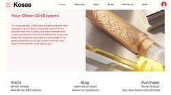
This project involved designing an original homepage for Kosas, a natural, healthy, and ethical beauty brand targeting Gen Z men and women. The primary objective was to create a website that is not only visually appealing with a clean, energetic, and trendy aesthetic but also ensures cohesive and accessible UX/UI. By focusing on trending website styles, the design aimed to enhance customer retention, strengthen brand equity, and encourage purchase follow-through. The homepage concept was developed to feature new and interesting products, offer valuable learning resources such as tutorials and demonstrations, and highlight special offers to drive visits, keep users engaged, and facilitate purchases.
How did I prepare?
To prepare for this project, I began by conducting comprehensive research on Kosas’s brand identity, target audience, and current market trends within the beauty industry. I analyzed user personas to understand the preferences and behaviors of Gen Z consumers, particularly their affinity for trendy, pop culture-inspired aesthetics and ethical product choices. Additionally, I reviewed successful website designs, such as Bon Appétit’s web page, to gather inspiration and identify effective strategies for driving user engagement. I developed detailed outlines and storyboards to map out the website’s structure, ensuring that the three key elements, driving visits, encouraging users to stay, and facilitating purchases, were seamlessly integrated into the design. This preparation phase also involved selecting an energetic color palette, modern graphics, and high-quality photography to align with Kosas’s brand personality.
How did I put my plan into action?
With a solid foundation from my research, I proceeded to execute the design plan using Figma, a collaborative design tool. I started by creating low-fidelity wireframes to establish the basic layout and navigation flow of the homepage. These wireframes focused on positioning elements that would highlight new products, provide educational content, and showcase special offers. After iterating on the initial designs based on feedback from peers and mentors, I advanced to high-fidelity prototypes, incorporating the chosen color schemes, graphics, and photography. The design process emphasized user accessibility and responsiveness, ensuring that the website would perform well across different devices and internet speeds. Although animation and advanced functionality were optional, I integrated subtle interactive elements to enhance user experience without compromising the website’s loading speed.
What were my results and lessons?
The finalized homepage design successfully met the project’s objectives. The project received an excellent grade, with instructors noting the cohesive aesthetic and user-friendly interface. Feedback highlighted the successful integration of trending design elements and the clear presentation of Kosas’s products and special offers. Throughout the project, I encountered challenges such as balancing creativity with usability and ensuring the website remained accessible despite its energetic design. I overcame these challenges by iteratively testing the design and incorporating user feedback to refine the interface. This experience reinforced the importance of thorough research, flexibility in the design process, and the value of user-centered design principles. Moving forward, I will apply these lessons to future projects to create even more effective and engaging digital experiences.


